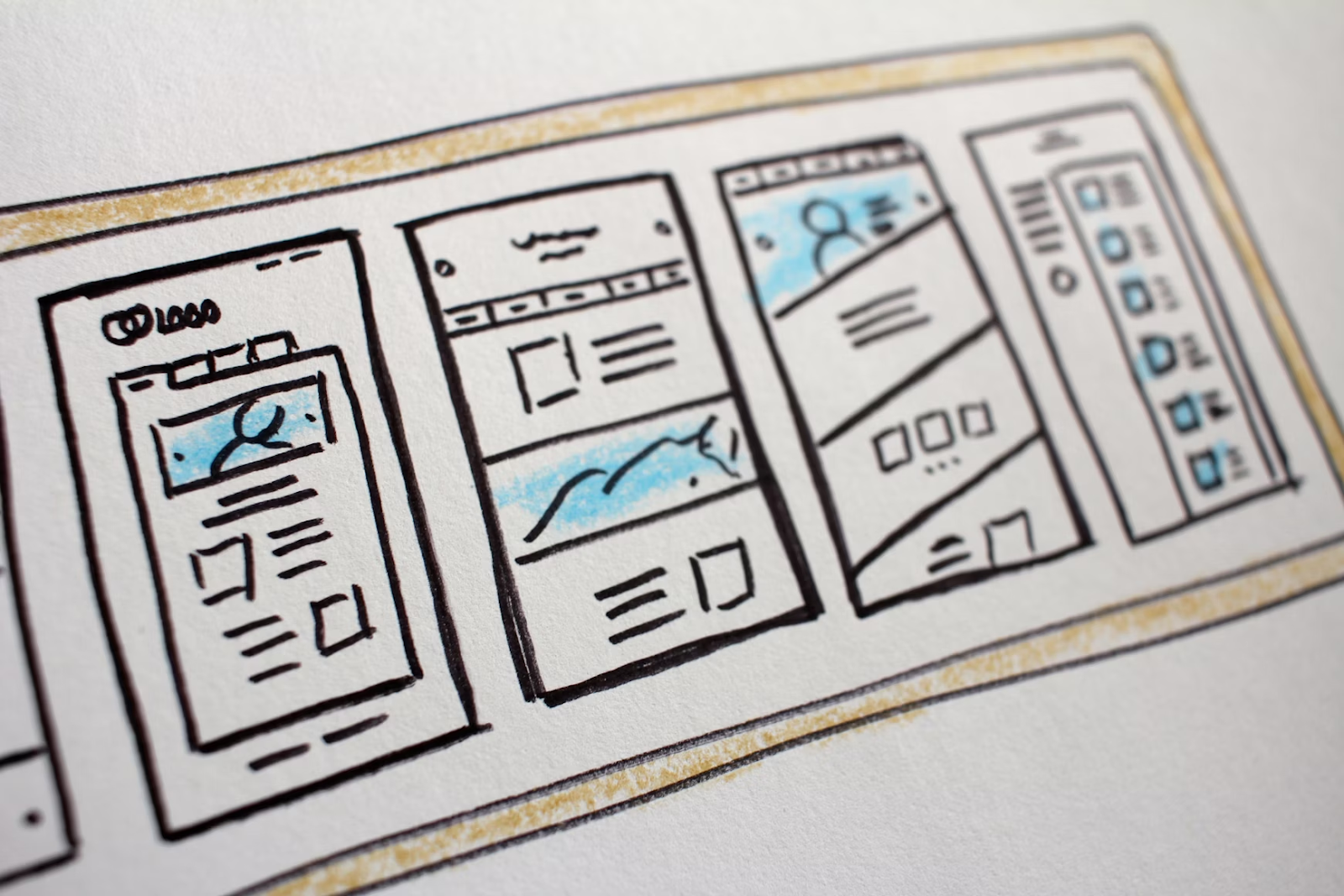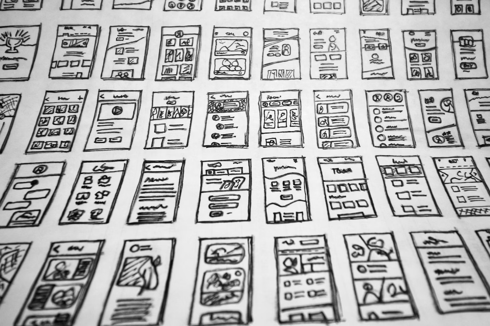
Learning how to create a highly converting landing page is an essential skill. The entrepreneurs who master it can literally gobble up money. But getting the hang of creating these pages isn’t always straightforward. Conventional education (and sometimes common sense) can conspire against you. Many people struggle for years with their landing pages. No matter how much tinkering they do, they can’t get them right. That’s where this post can help. The tips you learn here will nudge you in the right direction. By the end, you should know more about constructing killer landing pages that convert.
Table of Contents
Wait A Sec … What’s A Landing Page, Again?

A landing page is essentially a web page where you funnel your leads and try to convert them. It’s like a shop window and a sales rep rolled into one. Landing pages usually start with a “hook,” something you use to reel prospects in by offering to solve their problems. The next part is to build “authority.” Here, you show leads that you can help them with whatever they require. The final part is a compelling offer that gets them to convert.
For example, let’s say you run a business coaching agency. You could start your landing page with a headline like, “Grow your business in four hours a week.” Then, you could demonstrate your authority by listing your successes with previous clients (providing links to independent reviews if possible). Finally, you could give prospects a special offer if they sign up for your coaching in the next 24 hours, like 10% off.
Building A Landing Page: How To Master The Art

Most people aren’t good at building landing pages despite having landed on them plenty of times. The reason for this is that selling isn’t always intuitive. We can’t always see the psychological terrain explaining why we buy from others.
The good news is that there’s a formula to it. Other people have already discovered what works, reducing the amount of research you need to do. This section runs through the essential elements of a landing page. You should include as many of these as possible to maximize its impact.
Add A Hero Fold
The first step is to add a hero fold. You want to explain what you offer and why leads should choose you, not your rivals.
Don’t leave this information at the bottom of the page. Make it visible upfront to clarify the value you offer immediately. Remember, people visiting your site have limited time and attention. Ninety percent won’t read a lengthy sales pitch to get to the meat of your offer.
If you have a special offer, include this in the hero fold. Grab their attention immediately. Then, use the rest of the page to develop rapport and build credibility.
Add Your Contact Details to your Landing Page
Next, ensure you put your contact details on the page. Savvy leads will search for these to determine your legitimacy. Online scams often have attractive sales pages and convenient boxes for prospects to enter their credit card information. But they don’t have any concrete contact details, destroying trust.
Provide your email and physical address. Also, add your phone number so people can contact you if you have a niche business.
Make Your Heading Catchy
When building a landing page, you also want a catchy heading. It should stick in your audience’s mind.
Ideally, the heading should be:
- Memorable
- Solve a problem that a lead has
- Provide some level of reassurance
- Help the prospect along the path to where they want to go
Shoe-horning all this goodness into a single phrase or title is hard, so most landing pages also include a subtitle. But you get the idea: you want to grab your visitor’s attention and convince them that they should choose your products or services.
Building a killer title is hard, so don’t be afraid to use shortcuts. Here are some ideas:
- Riff with AI, trying various prompts to see what it comes up with
- Look at what your most successful competitors are doing and copy them
- Copy ideas from outside your industry or niche that always seem to garner attention and sales
- Conduct A/B testing to see which landing page titles get more clicks and conversions
Be Concise
At the same time, you need to be concise on your landing page. Avoid the temptation to waffle or make visuals complicated.
Most great landing pages have a short title and subtitle, followed by concise text. They also have video introductions, simple images, and a minimalist design. Don’t let anything get in the way of leads understanding your offer and how they can benefit.
When constructing your pages, avoid the following:
- Complicated backgrounds that distract users’ attention
- Images or themes that contrast with your brand theme and voice
- Long-winded prose in dense paragraphs
- Too many CTAs that get in the way of the flow of the page
- No mobile optimization
- No navigation elements that take users to your main pages or site
Use More Images
Some landing pages focus exclusively on writing. But, again, these aren’t the most successful. If you want your pages to thrive, you need images.
Research shows that visual elements increase dwell time. Prospects are more likely to spend longer on your pages if they have something pretty to look at.
You can also include infographics or dynamic visuals to the same effect.
A video of you making your sales pitch is the most powerful technique. These create an authentic connection between you and your audience, showing them the person behind the brand and helping to build trust. You can also include portfolio pictures, especially before/after examples.
Write Exciting Copy
Next, you want to inject your landing page copy with some excitement. People don’t want to read dull text.
When writing, try to get inside your audience’s heads. Think about what it’s like to be them. Why are they on your landing page? What do they want?
When you enter this state of mind, you can better uncover what they want from your writing. It trains your unconscious to see things from their perspective so you can address their pain points while exciting and engaging them.
Provide A Solution
Prospects visit your landing pages because they want you to solve their problems. Your job is to demonstrate you can fix whatever issue they face for a price they are willing to pay.
These solutions can be as straightforward or complex as you want, provided you communicate them effectively.
For example, if you run a mattress cleaning business, your solution should be eliminating bugs, which is straightforward. Similarly, if you run a software enterprise that manages field operations, your solution coordinates labor. It’s a bit more complicated, but it is still something you can explain.
When you have a solution, list the main thing you solve on your landing page, plus features that deal with pain points.
For example, for the mattress cleaning brand, your solution might be ensuring customers get a “hygienic mattress.” Then, you might deal with various pain points by talking about how you avoid chemicals and use techniques that won’t damage the bed.
Get solutions on your landing page quickly. Don’t leave prospects waiting. People want to find out how you can help them early on, preferably in the heading and subheading.
For example, the mattress cleaning company might write something like:
- Heading: Wake Up To A Cleaner Healthier You With Our Mattress Cleaning Services
- Subheading: Our professional mattress cleaning removes 100% of dust mites, allergens, and more without chemicals
This headline provides prospects with a solution upfront, while the subheading deals with their pain points. It’s a simple formula that works.
A Clear CTA
Finally, you want to ensure your pages include comprehensible CTAs. These should be short, simple, relevant, and encourage action.
You see some brands experimenting with weird and wacky CTAs. These are trendy, but they risk confusing most prospects.
Better CTAs have the following properties:
- They are clear
- They offer some sort of reward
- They feature early on the landing page (where visitors can see them quickly)
- They have concise text instructions
- They let readers respond instantly
Good examples of CTAs that embody these characteristics include:
- Grab your free guide
- Use our limited-time offer
- Try your luck now
- Take our 3-minute quiz
- Slash your bills today
Ensure your CTA makes sense in the context of the products and services you want to sell. You want it to draw people in and get them to take the next step down the sales funnel. For example, an online skincare brand might use the CTA “Take our 3-minute quiz to discover your ideal skincare routine.” Likewise, bulk niche food retailers might have a CTA like “Get 10% off your first order by entering your email below.”
Wrapping Up

Now, you should know more about how to build compelling landing pages that convert.
If you want to start building these compelling sales funnels immediately, try my done-for-you landing page funnel service. I add the copy and design the structure around your offer, ensuring you set it up for conversion.
Next Post
Previous Post
Whether you need a stunning website or strategic SEO, I’m here to help you stand out, get noticed, and grow your business. Ready to take the next step?
Are you ready to
build a website that works just as hard as you?
explore the services
View the Portfolio