Share Post

Don’t Hit Publish Yet—Here’s What Your Homepage is Really Missing

Filed in Website — March 15, 2025

(And How to Fix It Without Screaming “Buy Now!”)

You picked the colors. You obsessed over fonts. You added just the right amount of whitespace to make it all feel aesthetic. And yet, something’s off. No one’s booking. Or clicking. Or…doing anything.

The site looks good. So why does it feel like it’s floating in limbo?

Here’s the hard truth: A beautiful homepage means nothing if it doesn’t work.

And by “work,” I mean guide your visitor somewhere meaningful—toward clarity, trust, and ultimately, conversion. It’s not about being pushy or sales-y. It’s about being intentional.

So before you hit publish (or if you already did and things feel meh), let’s talk about what your homepage might be missing—and how to fix it. I’ll walk you through the anatomy of a homepage that actually converts without making people want to run for the unsubscribe button.

P.S. If you want the shortcut version, I made a free Homepage Blueprint just for you. Grab it at the end of this post!

The Real Job of Your Homepage

Your homepage isn’t a digital business card. It’s not a brochure. And it’s definitely not just a vibe.

It’s your brand’s personal concierge.

The one who greets visitors at the door and says, “Welcome! Let me show you around.”

It needs to do four things fast:

  1. Tell me who you are.
  2. Tell me who you help.
  3. Tell me what I can do here.
  4. Tell me what to do next.

If it fails any of those, people bounce. Harsh, but true.

And most homepages? They miss the mark because they’re too focused on being pretty and not enough on being useful.

Common Mistakes That Make Your Homepage Pretty—but Useless

Let’s lovingly roast a few common homepage sins. If you see yourself here, no shame. Just…fix it.

1. The Vague Headline

“Helping you live your best life” means nothing if I don’t know what you do. Be specific. Be bold.

2. Button Overload (or Button Drought)

Either there are 11 different CTAs screaming for attention, or there’s just one lonely button at the bottom like it lost its friends. Your homepage needs strategic CTA placement.

3. Too Much About You, Too Soon

They don’t need your origin story right away. They need to know if they’re in the right place.

4. No Flow, Just Vibe Soup

A homepage should feel like a guided tour, not a Pinterest board of unrelated blocks.

5. Design Without Direction

That stunning full-width image? Cool. But if it doesn’t lead somewhere, it’s just taking up space.

The Anatomy of a Homepage That Actually Works

Now we’re getting to the good stuff. Here’s how to structure your homepage like a strategist.

Hero Section: Clarity First

This is your first impression. It needs to:

  • Say what you do (clearly!)
  • Speak to your ideal client
  • Include a CTA above the fold

Example:
Brand & Website Design for Service Providers Who Are Ready to Raise Their Rates and Show Up Like It.

Keep it simple. Your nav bar should make it easy for people to find what they need.

  • Home
  • About
  • Services
  • Portfolio or Results
  • Blog or Resources
  • Contact

Bonus points if you have a “Start Here” or “Work With Me” button that stands out.

Your Offer, At a Glance

What do you do? For who? Link to your core services with short, snappy descriptions.

Social Proof

This can be:

  • Testimonials
  • Stats (like # of clients served or downloads)
  • Logos from brands you’ve worked with
  • Case studies

People trust people. Show them you know your stuff.

Your Why (But Keep It Snappy)

Yes, tell a bit of your story—but make it relevant to them. Why are you the guide they’ve been looking for?

Multiple CTAs

Not everyone is ready to “Book Now.”

Offer low-commitment CTAs:

  • Learn More
  • View Portfolio
  • Take the Quiz
  • Download the Freebie
  • Start Here

Meet people where they are.

Want Help Mapping All This Out? Grab the Free Homepage Blueprint
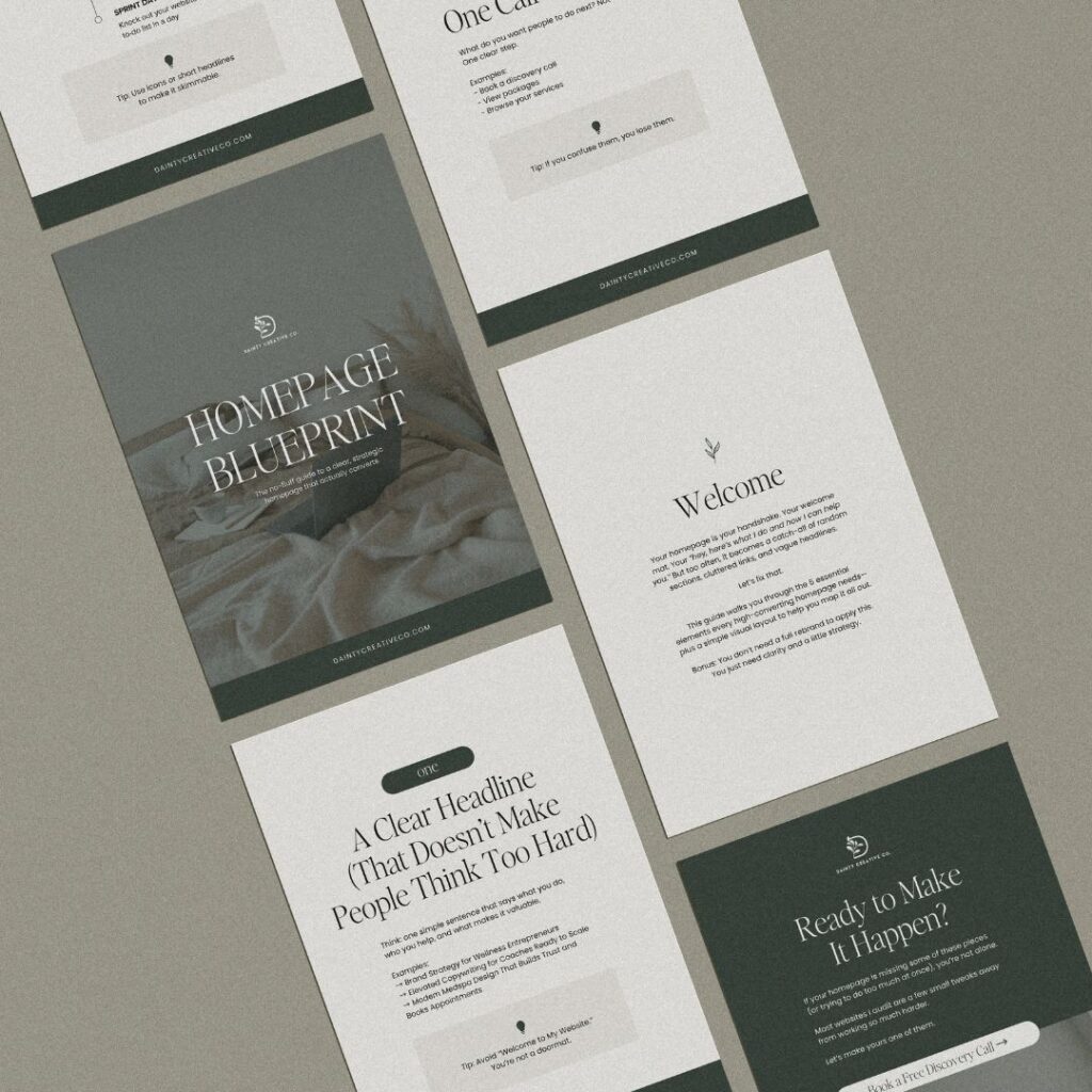
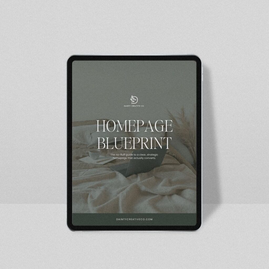
I made you a fill-in-the-blanks PDF that pairs perfectly with this post.

It’s called the Homepage Blueprint and it’s designed to:

  • Help you get clarity on your messaging
  • Plan the structure of your homepage
  • Add strategy to your layout (without coding a thing)

Download it instantly

Quick Self-Audit: Is Your Homepage Working?

Grab a notebook (or hey, that freebie) and ask yourself:

  • Can someone tell what I do in 5 seconds?
  • Is there one clear action I want them to take?
  • Do I sound like a human, or a corporate brochure?
  • Do I have proof or results on the page?
  • Does the flow guide people down the page naturally?
  • Are there too many CTAs… or none at all?

If you said “umm…maybe?” to any of these, it’s time for a few tweaks.

You Don’t Need to Be Pushy to Be Persuasive

A homepage that converts doesn’t scream “BUY NOW OR ELSE.”

It quietly, confidently invites. It speaks clearly. It removes confusion. It makes it easy to trust you.

When your homepage has intention behind it, the whole site becomes more effective. Visitors aren’t guessing what to do. They feel guided.

And guided people? They click. They book. They buy.

Don’t Just Hit Publish and Hope

Your homepage isn’t just a welcome mat. It’s the beginning of a relationship. And relationships thrive on clarity, not confusion.

You don’t need a full redesign. You just need a plan.

Start with the free Homepage Blueprint—and if you want someone to look it over with expert eyes, I offer Sprint Days and full design packages that bring strategy + beauty together.

Download the Blueprint and give your homepage the intention it deserves.
You’ve got this. And I’m here if you need backup.

We solemnly swear to only pop up in your inbox with tips for your small business and website that we’ve found super helpful. Plus, you’ll get the inside scoop on special savings and new services.

Get business, website design, and SEO tips, plus first dibs on all the Dainty deals.

Subscribe To Our Newsletter

Browse by Category

A millennial Latina, wife, boy mama, night owl and a serial entrepreneur, website designer, and SEO expert who lives for creamy lattes, swears by time blocking, and will never stop being obsessed with Harry Potter.

Hi, I'm valery

Whether you need a stunning website or strategic SEO, I’m here to help you stand out, get noticed, and grow your business. Ready to take the next step? 

Are you ready to
build a website that works just as hard as you? 

explore the services

View the Portfolio

|  site by me

|  Terms

© 2025 Dainty Creative, all rights reserved.

privacy