
What is a mood board? It’s the visual snapshot of your brand’s personality — the colors, fonts, and images that set the tone for everything you create.
Think of it like planning a party. Before anyone shows up, you’re choosing the decorations, the playlist, maybe even a signature cocktail. Those choices set the vibe long before the first guest walks through the door. A mood board does the same thing for your brand — it makes sure the “mood” feels intentional and consistent no matter where people find you.
A mood board isn’t the same as a brand guide. Your mood board is the inspiration… the vibe check. A brand guide is the rulebook with exact HEX codes, logo usage, and spacing rules. Start with the mood board, and your brand guide grows from there.
What Is a Mood Board?
A mood board is the single place where your brand’s visual building blocks come together — your brand color palette, your typography choices, your imagery style, and any design details that capture your overall vibe.
Here’s what that actually means:
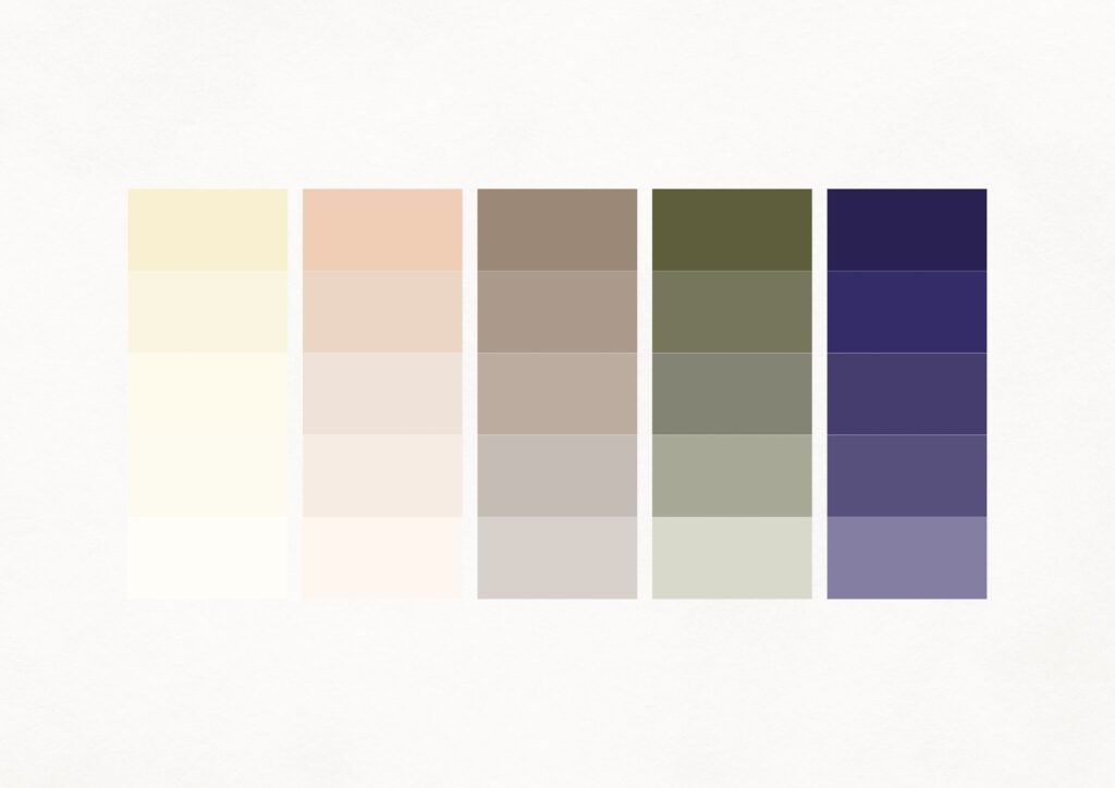
- Brand Color Palette – This is the set of colors you commit to using everywhere: website, social posts, proposals, even your invoices. Usually 3–5 main colors plus neutrals. Each color plays a role, maybe one feels warm and inviting (hello, pastel orange), another feels calm and reliable, while a neutral grounds everything.
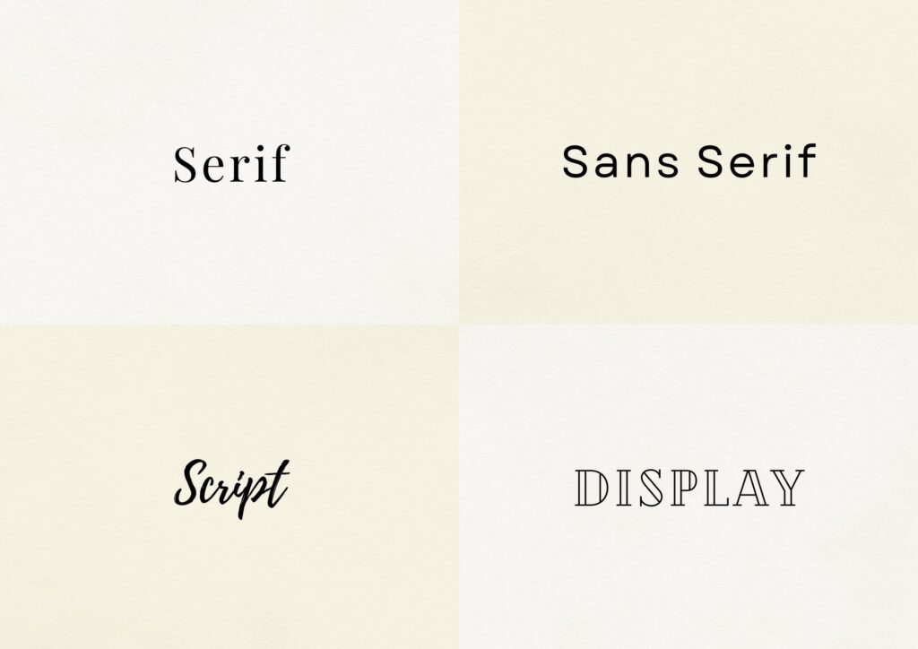
- Typography – Fonts carry personality. A serif font can feel classic and timeless, while a sans serif comes across as modern and approachable. Add in a script or display font for accents, and suddenly your words have a voice, not just letters on a page.
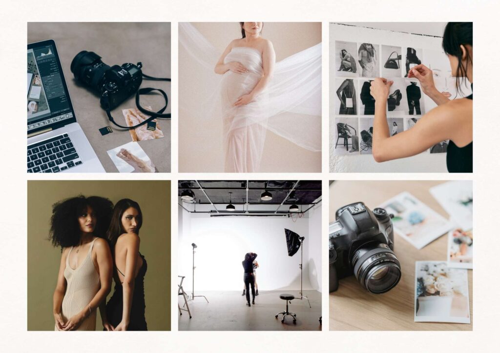
- Imagery Style – This is the look and feel of the photos you use. Are they light and airy? Bold and dramatic? Clean and editorial? Your imagery should spark the same emotions your brand wants to evoke and look like they belong together when placed side by side.
When you bring all these pieces into one snapshot, you’re creating more than a collage. You’re giving your brand a visual home base — something you (and anyone on your team) can reference to keep things consistent.
Key Benefits of a Mood Board
- Clarity – All those ideas swirling in your head finally land somewhere you can see.
- Consistency – Your website, graphics, and proposals start looking like they belong together.
- Communication – Designers, copywriters, or team members don’t have to guess your style, it’s right there on the board.
- Confidence – No more rebranding because you “fell in love with a new font.” Your decisions are already made.
What to Include in a Mood Board
A strong mood board isn’t about tossing in everything you like — it’s about curating the essentials that define your brand. Think of it as a recipe: a few core ingredients, measured just right, give you a flavor people recognize instantly.
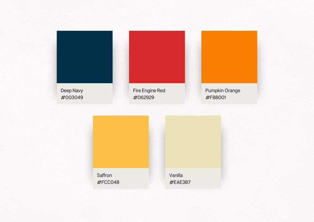
Brand Color Palette
Your palette sets the emotional tone and makes your brand recognizable in seconds. Without it, you’ll end up grabbing random colors on Canva until your posts look like they came from five different businesses.
Aim for:
- 1–2 darker shades for text, accents, or grounding (navy, charcoal, deep green).
- 1–2 lighter shades for backgrounds and breathing room (cream, blush, pale gray).
- 1 bold or personality color to inject energy (pastel orange, bright coral, mustard).
Each color has a job. Dark tones anchor. Light tones balance. Bright tones grab attention. Together, they make your brand feel polished and intentional instead of pieced together.
Make sure your colors actually work in practice. Backgrounds should allow for text to be readable on top of them. If your accent color clashes or your background shade makes white text disappear, it’s not doing you any favors. Beauty is important, but so is visibility.
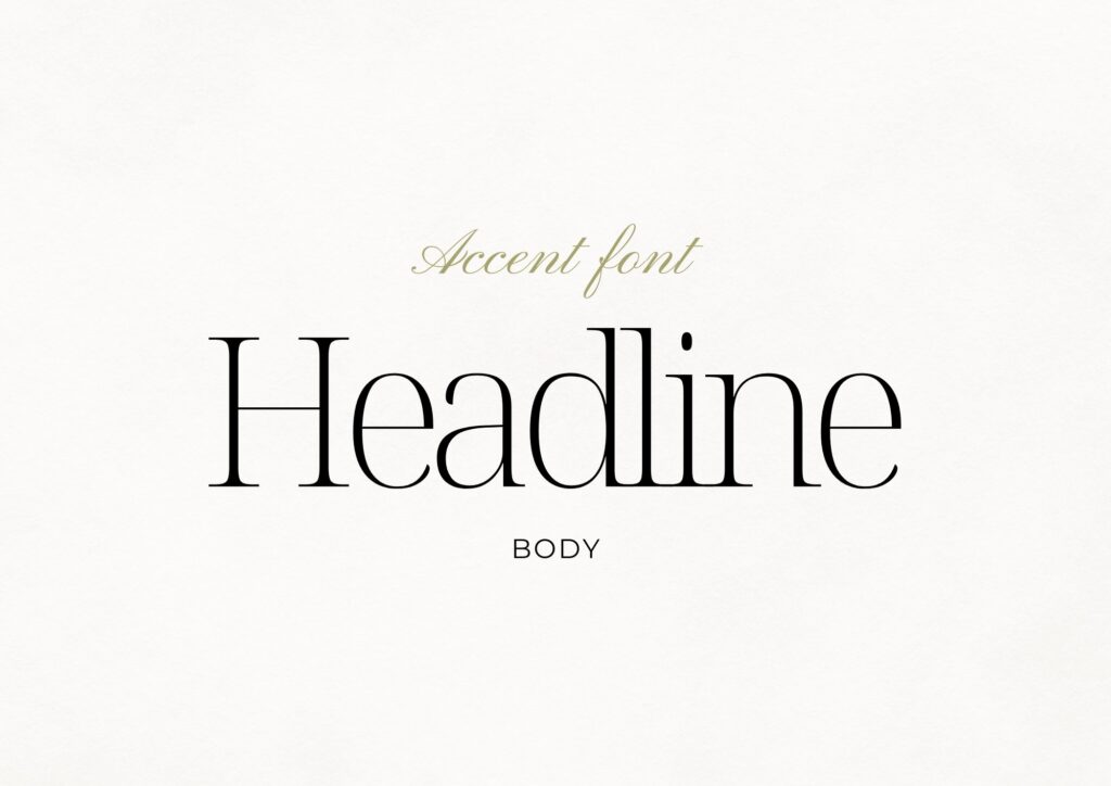
Typography
Typography is just fonts — but it’s also silent branding. Think about luxury houses: Chanel uses a timeless serif that signals heritage and sophistication. Tech brands lean into clean sans serifs to feel modern and approachable. Your fonts do the same for you.
Pair two to three fonts max:
- One headline font (attention-grabber, personality)
- One body font (easy to read, neutral tone)
- One accent font (optional) to add a touch of flair
Used consistently, typography gives your brand a voice before anyone even reads the words.
Imagery
Your imagery style is how your brand “feels” in photos. Without defining it, you’ll end up with a random mix: one polished stock photo, one moody shot, one selfie — and none of it looks cohesive.
Ask yourself:
- Do you want your visuals bright and airy (like a sun-drenched studio)?
- Dark and moody (lots of contrast, more edge)?
- Editorial and polished (high-fashion vibes)?
- Cozy and organic (warm tones, lifestyle moments)?
Collect 6–8 images that look like they belong at the same party. If one feels out of place, swap it until the whole set feels cohesive.
Patterns or Graphic Elements
Optional, but they can give your brand depth. Think subtle linework, shapes, or textures you can repeat across your website and social graphics. They’re like seasoning in a recipe — not the main dish, but they add flavor.
Keywords or Phrases
Words matter too. A handful of short words or phrases — “grounded,” “luxurious,” “playful,” “approachable” — act like anchors, reminding you of the overall vibe you’re building toward.
Types of Typography (And Why They Matter)
Typography deserves its own spotlight because it does a lot of heavy lifting in your brand. Each type communicates something before anyone even reads the words.
Serif Fonts
Classic, established, timeless. Think Chanel or Vogue. They instantly signal authority and luxury.
Sans Serif Fonts
Clean, modern, approachable. Brands like Google or Spotify use sans serifs to feel simple and accessible.
Script Fonts
Playful or elegant, depending on the style. Best used sparingly — like a handwritten signature at the end of a letter.
Display Fonts
Bold and dramatic. These are attention-grabbers — best saved for headlines, not paragraphs.
Pairing fonts from different categories creates balance. A sans serif body font paired with a serif heading feels luxe but still approachable. Add a touch of script as an accent, and you’ve got personality without chaos.
The Power of a Brand Color Palette
Your brand color palette isn’t just about looking good — it’s about making people feel something the moment they interact with your brand.
How Color Shapes Emotion
- Red – Energy, urgency. Why McDonald’s and Target both use it.
- Yellow – Optimism and cheer. McDonald’s golden arches? Not an accident.
- Blue – Trust and dependability. Think Facebook or American Express.
- Green – Growth and health. Whole Foods built an empire on it.
- Black + White – Luxury, minimalism, sophistication. Fashion houses use it for a reason.
Building a Cohesive Palette
A well-balanced palette should have range:
- Dark shades to ground your designs and give contrast
- Light shades to provide space and balance
- A bold accent to show off personality (yes, pastel orange counts)
- Neutrals to hold it all together
Without these layers, your brand ends up feeling flat or mismatched. With them, you create instant recognition. Tiffany didn’t pick that blue by accident — it became the brand.
How to Create a Mood Board
Now that you know what goes into one, let’s walk through how to build it step by step:
Step 1: Define Your Goals
What do you want people to feel? Grounded? Luxurious? Playful? Write that down first.
Step 2: Gather Inspiration
Pinterest, Unsplash, even your camera roll. Collect what sparks the right vibe.
Step 3: Curate Selectively
Edit ruthlessly. If it doesn’t align, it doesn’t belong.
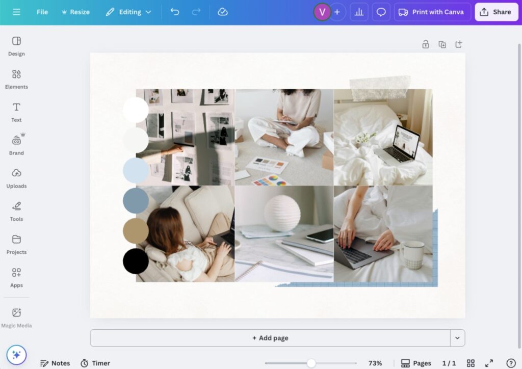
Step 4: Build It
Use Canva (or your tool of choice). Drop in your colors, fonts, imagery, and keywords.
Step 5: Use It
Don’t let it sit in a folder. Check your board before you design, post, or launch anything.
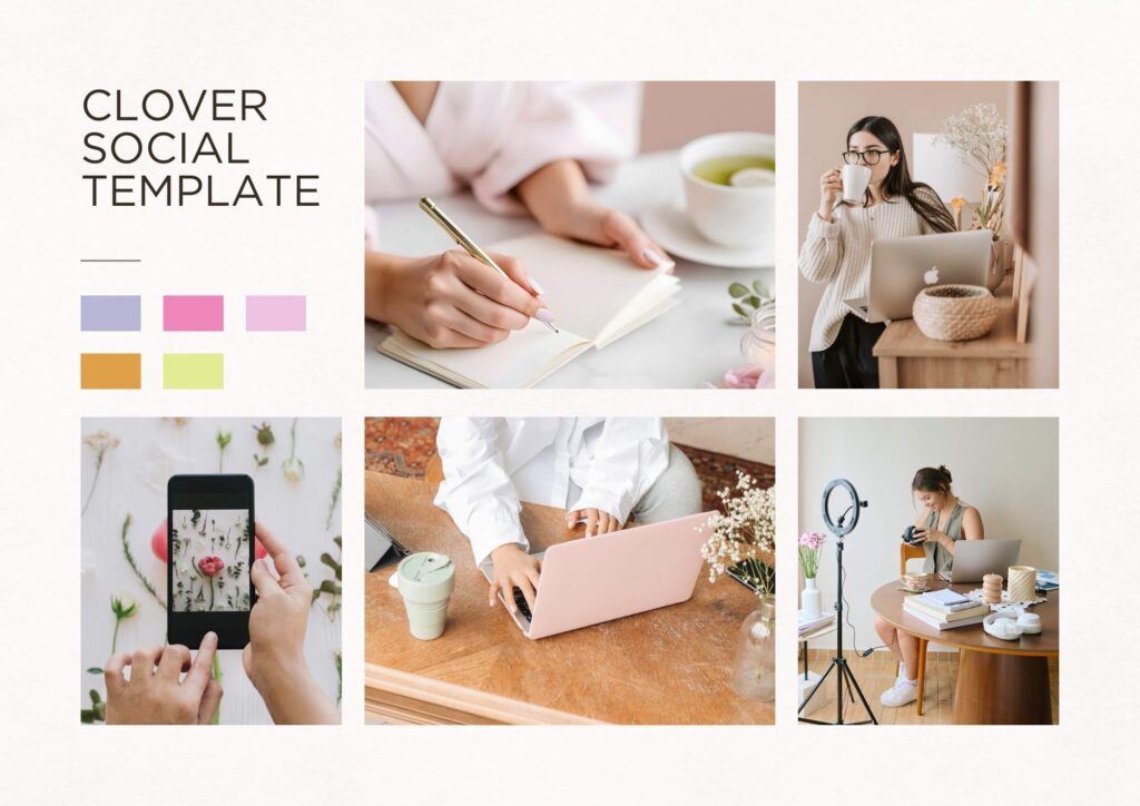
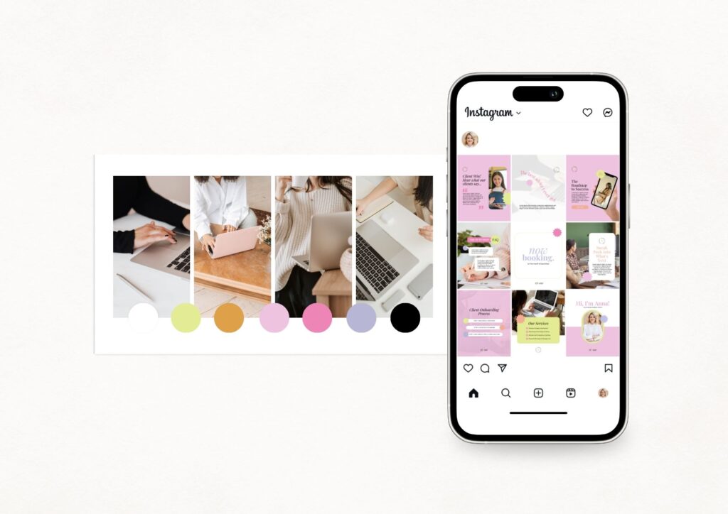
Real-Life Example
Clover Social Templates
When I created the Clover Social Templates, the very first thing wasn’t a post or a logo — it was the mood board. Bold colors, playful typography, fun graphics. That one board shaped every design choice.
The result? Templates that feel cohesive and intentional instead of a random Canva mash-up.
Set the Right Mood
Why Mood Boards Are Worth It
Mood boards save you time, reduce decision fatigue, and give you a foundation that grows with you instead of shifting every time you get bored of a font. Without one, your brand feels scattered. With one, it feels grounded.
Your Next Step
Open up Canva or Pinterest tonight and start pulling in the colors, fonts, and imagery that make you say yes, this is me.
👉 DIY route? Shop my Canva brand guides + templates. They come with ready-to-use mood boards you can make your own.
👉 Want it done for you? Book a branding + website design project. I’ll craft your mood board and a full identity that feels like you.